Thursday, July 26, 2012

RIP Franz West

Franz West 1947 - 2012 
Artist, Hero

Saturday, July 14, 2012

The Omitted CP Sondheim Review


I think Cara Ober at Bmore Art started an excellent discussion about the quality, QUANTITY and honesty of arts criticism in Baltimore.  This is a discussion in which I am endlessly involved, proudly as a member of the art critical writing force while simultaneously lamenting its smallness and consequential lack of coverage for the gallery I co-direct.  
As a member of the arts community, wearing many many hats happily and often exhaustedly, I would invite anyone with any interest to contribute to the conversation.  BLOGS ARE FREE.  There is a constant paranoia about the perception of our multiple roles, our own studio practices and competitive inclination to slight our fellow artists.  I have to say, in the case of every arts writer I know, there is never a personal or duplicitous motivation behind the need for and crafting of the local arts dialog.  The money isn't great, our contributions are a labor of love and a lot of thought.
With criticism, here I mean negative criticism, comes the vested interest in the continuation of the conversation, the urging on of artists to continue to work hard, be open, and to produce great work.  
Through my gallery and writing both, I am only seeking to promote and work hard to gain attention at a national level for the unbelievable range of talent that exists in this city.  That being said, the Sondheim seems like an amazing opportunity in and of itself to attract this kind of attention.  It is largest art prize in a city that has been enjoying an international reputation for being cool and cutting edge, especially thanks to its music scene. 
Unfortunately, the Sondheim has little impact on the national art front, it is not a household name and many people cannot name its recipients, however talented.  Despite my disinterest in Matthew Porterfield's works last year, it was politically the smartest move and biggest push toward disseminating the Sondheim prize and its benefits into the greater art world.  This year, however, I felt much of the work was of a weaker caliber, and did my best to contribute to the CP cover story two pieces that highlighted both what was strong about one artist, and what was lacking in the second's installation, hoping that this artist will continue to make work, and take bigger risks when presented with future opportunities.  My second piece was cut.  
I am a gallery owner, and the partner of a semi-finalist artist.  I have exhibited, both locally and in other cities, the works of many other semi-finalist artists.  My criticism is not based on the selection of the artists who where chosen, but how artists chose to represent themselves.  I would like nothing more than to be surprised by and introduced to new artists making excellent work through the Sondheim selection process.
Jury-based prizes are often determined on a grading system.  Some high scores are weighed down by low marks of those jurors who don't understand the work.  It is a general agreement amongst artists and anyone who has ever served on such a jury that those artists consistently in the middle scores, ones whom everyone can agree are "pretty good" are selected as finalists.  This can produce some conservative choices, and of course, some excellent surprises.  It is up to those artists to put their best foot forward and give both the selection of their artwork and the prize prestige and legitimacy.   THIS SHOULD BE A HUGE DEAL!
This is the piece I wrote about Jon Duff that was replaced, after much deliberation and the added delicacy of having a mutual, professional respect for one another, by my acting editor.
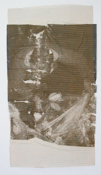

Photo from BmoreArt

Jon Duff is the youngest of the six finalists this year, a 2012 graduate of MICA's Mount Royal MFA program; he has been out of school for a mere 2 months. The works exhibited at the BMA are elements of his thesis show, pared down and spaced out around his allotted portion of the museum. Working in painting, sculpture and a single digital print, Duff's pieces reflect the stylistic freedom and unaccountability that comes with the student studio process, along with the pitfalls of trying to relate this erratically referential practice (and learning process) to an art-savvy audience.

Duff's spacing of the works and experiment with sparseness is detrimental to the impact of the overall installation. An odd, even attention is given to almost every piece in the show, with the exception of the lone digital print - an image of minerals and semi-precious rocks arranged on shelves- which is the only piece in a frame, and the only two-dimensional work hung on the wall. Four unframed, modestly-sized paintings are placed directly on the floor, spaced out at odd intervals between the sculptural works. Each painting depicts a flat, colorless shape sitting atop a spray-painted, grey gradient. Washy neon color accents in transparent primary colors surround the main form in both tidy shapes and semi-aggressive smears. None are particularly memorable. As a recent graduate, the decision to re-show recent works without much adjustment for the venue can be chocked up to circumstance, and inexperience. The end of the school year can be a tough transitional period, at which point one's thesis exhibition seems like the be-all-end-all of your artistic output. In retrospect, it is usually just a point from which to begin your independent artistic career.

Created for a smaller, more intimate viewing experience, the pieces lose visual potency when physically separated from one another. They sit apart like pieces of a puzzle, none making a large impression individually, but as a whole might articulate something more interesting. The urge to rearrange and push together certain pieces, and to pick the paintings up off the floor is almost uncontrollable.

The apparent stylistic consistency in Duffs work seems to be a constant battle between a meticulous representation of “Contemporary Art” (as appropriated from a wealth of internet-based art research) and a desire to illustrate a child-like frustration in the studio. Messy paint and mixed media (including fertilizer, and pieces of denim) coat a Franz West-like blob in his sculpture titled “Stranger,” and hang off of a few nondescript objects on wire shelves in “Closest Maid.” Between these works, “Slouch,”a sculptural work consisting of a sock oozing latex paint onto a white chair, and “Ape” a painting with fertilizer flung across it, the works read as a mix between a prank and tantrum. A similar childish quality comes across in “Orange Drink,” the title given to a glass of neon orange resin on a boxy pedestal in the center of a blue rug. Duff's work seems to shrug at its own defeat and immaturity, which is both irksome and slightly endearing.

Thursday, June 14, 2012

New Realities @ John Fonda Gallery

New Realities
New paintings by Dan Perkins
Opening Friday, June 15th
7 - 9pm

Theatre Project
45 West Preston Street 
Baltimore 21201

Friday, June 8, 2012

Jack Henry
David Ostrowski

Opens: Saturday, June 9th, 7pm-10pm
Exhibition Runs:  June 9th - June 31st

Jack Henry is a Brooklyn based artist working mainly in sculpture. He received his MFA in 2010 from University of Maryland, College Park. Recent exhibitions include Fool's Gold (solo) at Greenpoint Gallery, Brooklyn, Work Sites (curated by Nudashank) at Stamp Gallery, UMD, College Park, and Shakedown at Dodge Gallery, NY.

David Ostrowski lives and works in Cologne, Germany. Ostrowski studied at the Kunstakademie Düsseldorf with Albert Oehlen. Recent exhibitions include F, Artothek, Cologne, 2012 (solo), Dann lieber nein, Figge von Rosen Galerie, Cologne, 2012 (solo), Sprechen sie dick (with Harmony Korine), Jagla Ausstellungsraum, Cologne, 2012, Between Two Ferns (with Michail Pirgelis), Mike Potter Projects, Cologne, 2011, Die Lügnerin (with Philip Seibel), Format:C, Düsseldorf, 2011, New Gestural Painting, September, Berlin, 2012 (group), Blitz, Rod Barton Gallery, London, 2012 (group), Tlk Drty, Amstel41, Amsterdam (group), BolteLang Zürich, 2012 (group).Ostrowski received a studio grant from the Kölnischer Kunstverein and the Imhoff-Stiftung for 2012.


NUDASHANK
405 W. Franklin St. 
3rd Floor
Baltimore, MD 21201

www.nudashank.com


Timothy App's Threshold @ Goya Contemporary


Within our small arts community, we are excited when we get to cheer on hard-working, talented individuals who make Baltimore a diverse and vibrant city. Annual art awards and an exciting DIY art scene provide regular opportunities to look in on the new, host the traveling, or experience the fleeting with enthusiasm and camaraderie. There is, however, a special kind of love reserved for those mid-career artists who have given their lives to Baltimore, contributing tirelessly to its intellectual and artistic landscape. Painter and Maryland Institute College of Art professor Timothy App has earned this sort of reverence through a consistent artistic and academic career, devotion to his students and community, and producing impressive bodies of work that continue to develop within the confines of the canvas and his super-flat, glazed surfaces.
Threshold, App’s current solo exhibition at Goya Contemporary, enjoyed a crowded and successful opening, as anticipated, but is undoubtedly best as a solitary viewing experience. Consisting of eight new, large-scale paintings and a handful of works on paper, Threshold is a quiet, meditative exhibition that forgoes the acute angles of his recent paintings in favor of rectangular forms and a comfortable symmetry. App’s subtle hues of muted grays, greens, and muffled purples hug expansive, central planes of black and white, which the artist refers to as “portals.” This description is fitting, as the layering and perspective appear to shift as viewers stand before them. These slight vibrations recall Mark Rothko, and the obsessively neat surfaces find company with finish-fetish artists like John McCracken.
In the canvas paintings, the compositions fit together like pieces of a puzzle. Each colored plane ends with a crisp lip where tape helped dam the layers of paint in their working stages. Slight shadows cast by these ridges play a visual trickery on some viewers, making them believe the paintings contain collaged elements, neatly adhered into their perfect geometry. App’s laborious selection of color shades, a quality of his work best appreciated in person, gives each painting a transparent and mysterious quality. Like Ad Reinhardt’s black paintings made up of subtle variations of color, App’s ambiguous grays and tans at the edge of the compositions look like raw linens upon first glance, but are actually subtle hues painted on canvas. The thin evenness of App’s glazing technique allows the texture of the fabric to come through.
Goya Contemporary Director Amy Eva Raehse explains that these new works are in dialogue with a number of App’s older series, including the homage paintings and vessels, which the artist recently revisited in preparation for a 2013 retrospective at the Katzen Museum in Washington, D.C. His oeuvre of the past decade shows small shifts in his formalist rigor, a fixation on parallel lines and rectangular forms bending into triangles and angular arrangements. In some works, rounded arcs swoop through otherwise hard-edged arrangements. After re-examining and documenting the older works for the forthcoming catalog that will accompany the Katzen exhibition, App picked up old threads in his work to create the new series. Compositions once again soften into right angles embodying the simultaneous language of a contemporary computer screen, with window-like layering and a modernist sensibility. Emanating a soft, central glow through the play of paint color, many of the pieces seem to refer to digital screens, stages, and Hiroshi Sugimoto’s long-exposure photographs of movie theaters. In particular, “Agora” and “Proscenium” most resemble monolithic projector televisions, with white, squarish planes resting on narrower black rectangles. The suggestion that these screens are off, the stage empty, adds a clever narrative to these otherwise abstract works: the contemporary substitute for meditation and tranquility versus the tranquility that can be achieved through painting.
In its title, Threshold conveys the spiritual and transportive nature of these new works, which are deceptive in their simple compositions. An intangible space opens up in the picture planes, existing for brief moments between colors and shapes and the slight translucence of the acrylic. From a distance it becomes hard to imagine that these works have a human creator, but this illusion dissolves with closer inspection. Slight imperfections, be they small areas of color inconsistency or minute wavers of a line, firmly root these works in the hand and the painting process. While the pieces in Threshold are more pared down than previous series in App’s career, both in composition and color variety, the end results are no less complex.

Monday, May 21, 2012

Highlights from MICA's 2012 Commencement Art Walk

 Nick Cubeta and James Bouche

 Nick Cubeta and James Bouche

  Nick Cubeta and James Bouche

 James Bouche

 Nick Cubeta

 Nick Vyssotsky

 Nick Vyssotsky

 Nick Vyssotsky

 Nick Vyssotsky

 Nick Vyssotsky

 Nick Vyssotsky

 Nick Vyssotsky

Betty Roytburd

 Will Pierce

  Will Pierce

 Will Pierce

 Suzanna Zak

 Sophia Belkin

Sophia Belkin

Tommy Doyle

 Bryan Edward Collins

 Colin Van Winkle

Colin Van Winkle

 Emily Coleman

  Emily Coleman (detail)

 Rachel Christensen

 Kat Hicks

 Kyle Dunn

 Ariel Klein

 Theo Willis

 Heather Day

 Heather Day

Yerin Kim

 Sage Trail

 Nabila Daredia

 Dana Bechert

 Dana Bechert (detail)

 Betty Roytburd

 Betty Roytburd

Alesha Burk

Saturday, February 11, 2012

Andrew Laumann : Hallowed Ground @ Pent House


Pent House Gallery presents the first solo exhibition of Baltimore artist/photographer Andrew Laumann (b. 1987).

Andrew was born and raised in Baltimore, MD. After spending four years traveling, he settled back in Baltimore in 2009, where he has been living and working s
ince. His work is concerned with the limbo between construction & destruction.

Opening reception Februrary 25th from 7-11pm


Closing March 3rd.

Gallery hours TBA and by appointment (andrewlaumann@gmail.com)
http://andrewlaumann.tumblr.com/

Tuesday, January 31, 2012

The Sum of Parts, curated by Amy Boone-McCreesh @ MAP Feb 22


Curators' Incubator: The Sum of Parts
Curated by Amy Boone-McCreesh
February 22 - March 24, 2012

Reception and Curator’s Talk: February 22, 6-8pm 

After the LONGEST-EVER wait and patient endurance of whatever the hell has been going on at MAP for the past year, Amy Boone-McCreesh FINALLY gets to present her excellent exhibition for [what would have been last year's] Curators' Incubator.  We have been eagerly awaiting the return or relevant programming!


In The Sum of Parts, Boone-McCreesh has brought together four contemporary East Coast artists who utilize repetative processes as the engine to building larger works. Sculpture, installation and drawing are explored through techniques such as knitting, cutting paper and mold-making for this multi-media exhibition.

Artists: Emily Barletta, Lauren Clay, Jerry Kaba and Nikki Painter.


Installation Views & Essay from Lesser Gonzalez Alvarez's solo show
Make / Shift @ Open Space

Make / Shift is on view at Open Space through March 10
All photos courtesy of Lesser Gonzalez Alvarez


MAKE / SHIFT

"Every feeling or desire we possess has been bought, sold or hijacked, debased or alternatively hyped into unreality, repressed or recuperated. Almost everything we care about has been turned into a commodity. But under a mountain of new gadgets and consumer items, in the midst of the 'new leisure society' and its cultural spectacles, we find ourselves cut off from real communication, frustrated and unhappy. Our isolation causes us to imagine that other people are happy and we wonder why our happiness eludes us." - Spectacular Times No. 12 (The Bad Days Will End), 1983 (via Gerry Mak's Facebook Status Update 1.21.2012)

Lesser Gonzalez Alvarez' Make / Shift subtly examines the contemporary labor dichotomy through a series of structures and images that straddle the boundary of physical and digital; design and execution. Each suggests the abundant production of real-estate and commodity along with entrepreneurial expansion, while giving equal visual attention to the issues of shoddy construction, compensation inequity, and halted production. Flooded with disparate messages of economic turmoil and the constant marketing of luxury goods via every available media outlet, Alvarez borrows from both news and advertisements to create a series of work that sneaks into the gap between the value of labor and the price of goods. 


Growing up a Cuban-American artist, Alvarez witnessed first-hand the divide in pay-scale between arduous, physical toil and specialized professions. Watching his father work a demanding landscaping job for a wage comparable to a few hours of his own design work, an inevitable guilt and unease began to pervade his practice. By incorporating construction material and building technique into his artwork Alvarez illustrates, and finds some personal reconciliation with that divide, while highlighting its larger societal implications.


A colorful work table, edged in custom paint treatments sits in the middle of space. Clean and functionless, the aesthetics and specific object arrangement take precedence over the practical, a 3D model of a work-table design. Hung on the walls around it are similarly color-treated images of interiors, building projects and immaterial monuments. Using free source imagery, photography of abandoned or unfinished housing developments, office parks, and temporary sets from Hollywood movie productions, Alvarez pacifies tensions with the application of a smooth, even gradient, creating deceptively elegant, glossy vignettes. Contemporary ruins are treated with a false-front of posterized perfection, the current state of decay is preserved and flattened into abstract digital illustrations. 1980's era color schemes and virtual spaces further reference a false commercial flourish. Transforming dormant, physical spaces into large-scale prints has turned each individually designed building into a labor-less duplicable and effectively marketable product once again. The print costs are low, the idealized commercial language is familiar, and our responses are conditioned. 


In a large vitrine sits a pile of misshapen cast concrete skulls, each with a plastic happy face icon from an Asian grocery bag embedded in its surface. Behind it in an altar-like arrangement, two collages with the same plastic faces, deformed by heat transfer, float upward in the composition. The piece serves as a small monument to the countless international workers on whose backs American wealth was built. With a political emphasis on new jobs and stimulating the economy through spending, there is a tendency to ignore the crumble, oppression and unattractive excess of our rapid low-quality / high-priced material production.

Alex Ebstein
January 2012